The single source of truth for the KILDE identity — foundation, story, logo, colour, type, photography, packaging rules, digital and financial-document systems, and voice. Where any other document disagrees with this guide, this guide prevails.
«Kilde» is Norwegian for source — the spring where clean water leaves the mountain. The coconut is nature's other source: a sealed reservoir of water, filtered by the palm. KILDE joins the Nordic idea of purity with the tropical origin of the liquid — «Naturens andre kilde» — positioning coconut water beside tap water, never against it.
An honest, natural alternative to the sugared and the artificial — a second source of everyday refreshment.
Pure coconut water, resealable, honestly labelled, at a price that belongs in the weekly basket.
Build the reference coconut-water brand in the Nordics through evidence, design and disciplined distribution.
«Naturens andre kilde» — the natural second choice beside water in every Nordic fridge.
Premium Scandinavian design at a fair grocery price — between commodity imports and overpriced wellness brands.
The Everyday Upgrader: health-aware adults 25–45 in Norway's cities who train, sauna and read labels — and their families.
Calm, clear, Nordic, quietly confident. Never loud, never miraculous, never tropical-cliché.
The brand carries the margin story: recognisable packaging and honest claims justify the price ladder from DTC to grocery.
Why the brand avoids exaggerated wellness language: the category is full of miracle claims. KILDE's credibility — with consumers, buyers and regulators — rests on saying only what the label and the laboratory can support. Restraint is the premium.
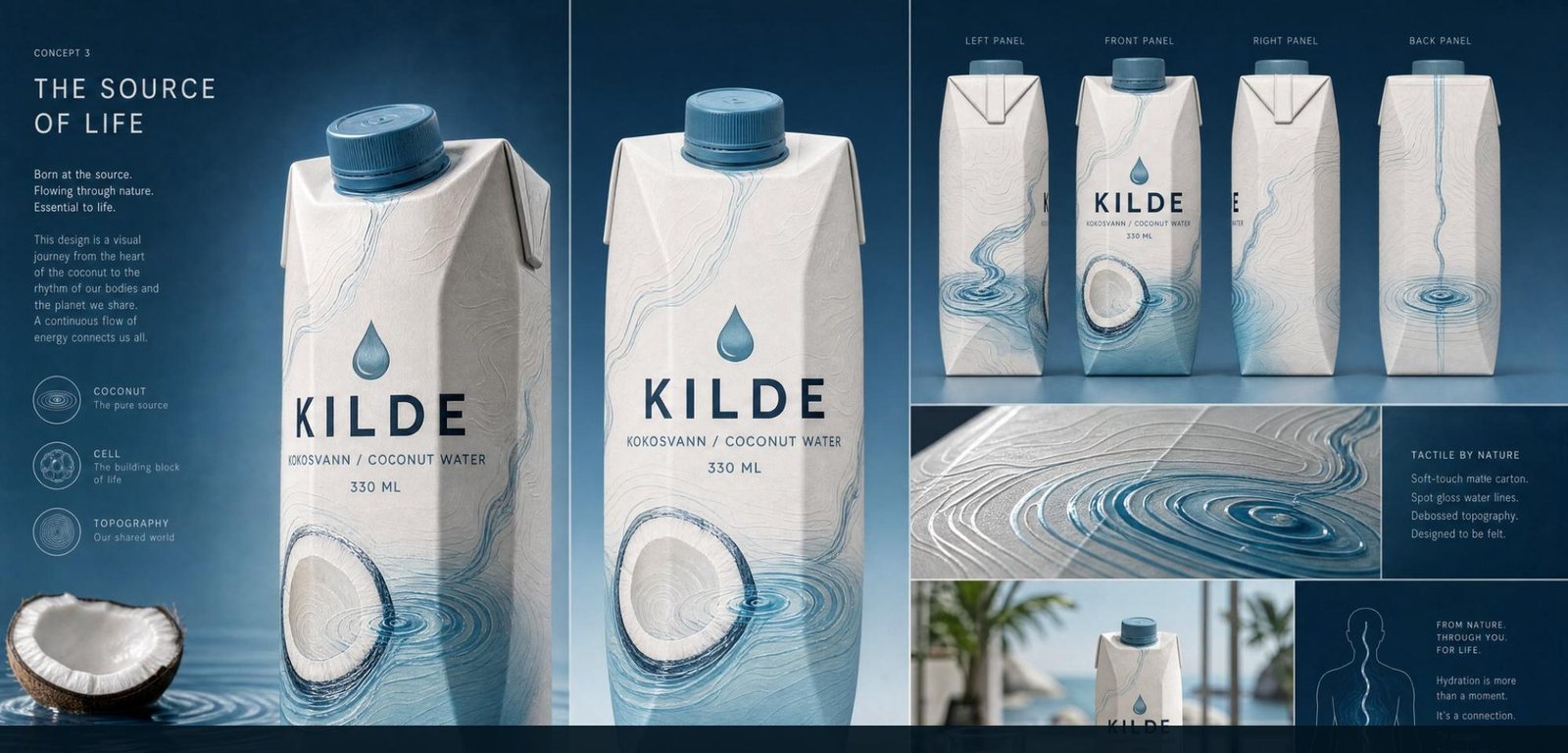
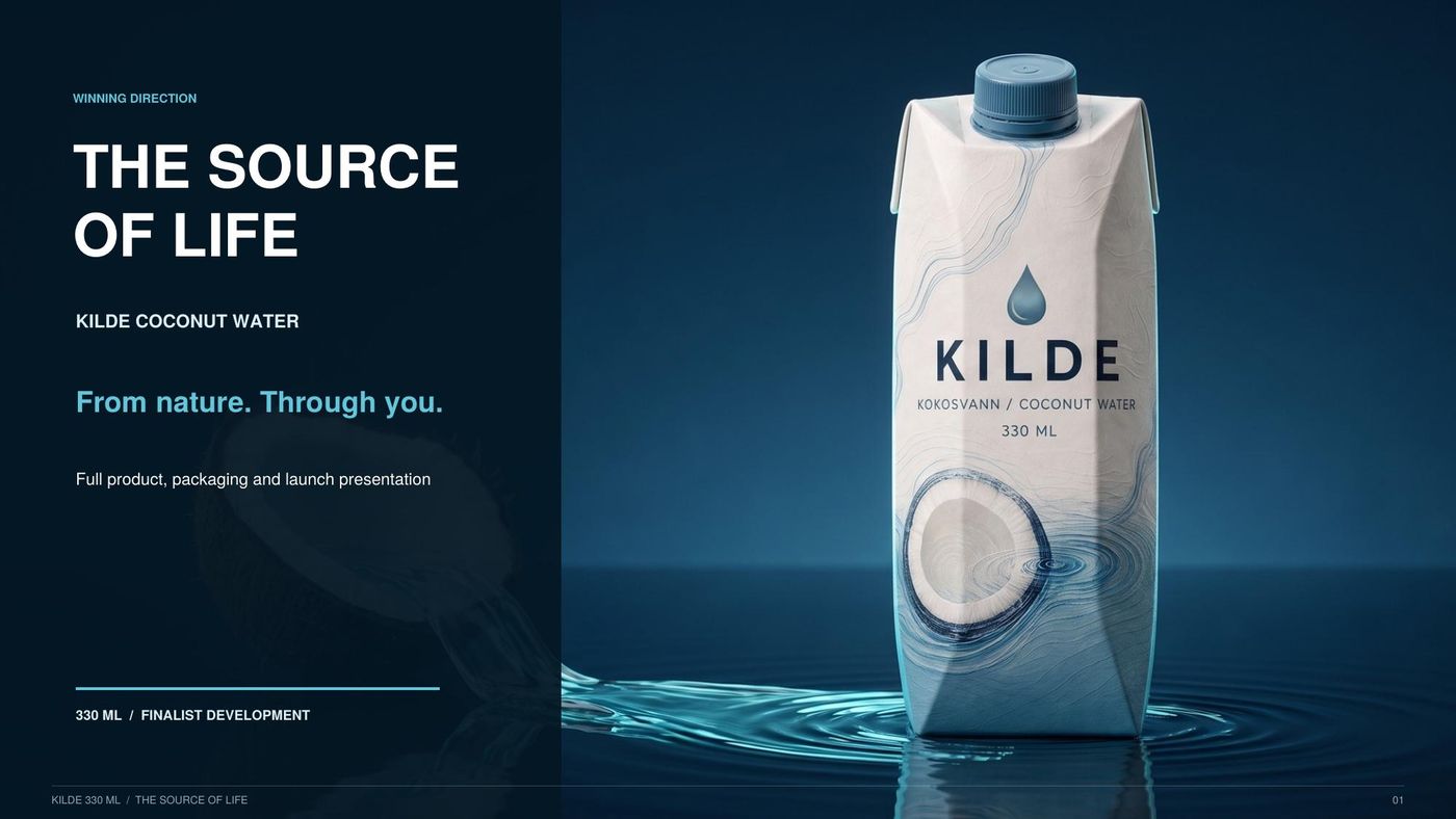
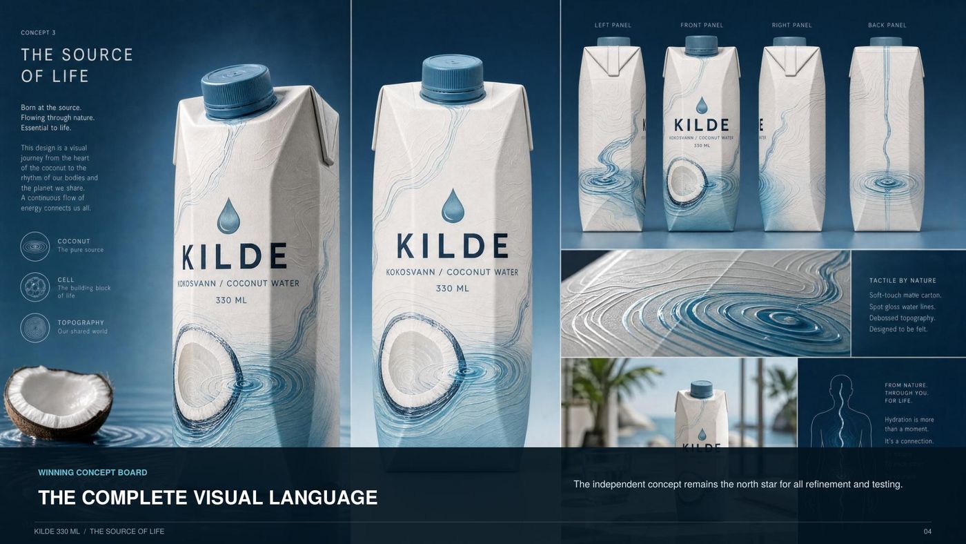
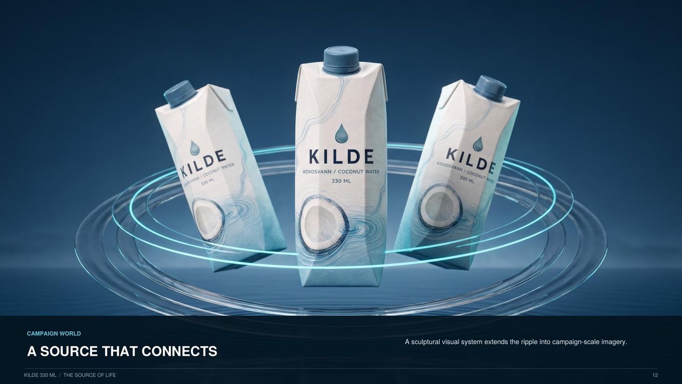
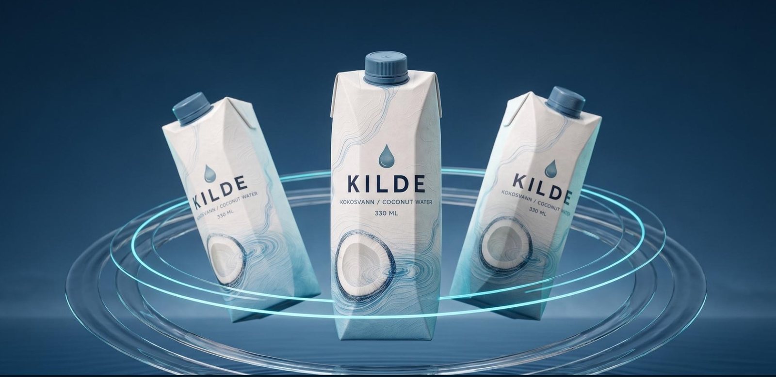
The winning concept: one continuous source line carries energy from nature into the product and onward to the consumer. Source → coconut → ripple → body. From nature. Through you. This is the approved KILDE brand direction; the full 20-page presentation below is the controlled design authority.
«From nature. Through you.»
The living source: one drop, one ripple, one carton standing in dark fjord water. Silent by default — press play.
Brand visualisation. Final production packaging remains subject to supplier and regulatory approval.
Begins beneath the cap and signals purity entering the pack.
Identifies the category without generic tropical photography.
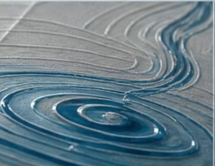
Creates a memorable focal event and communicates hydration.
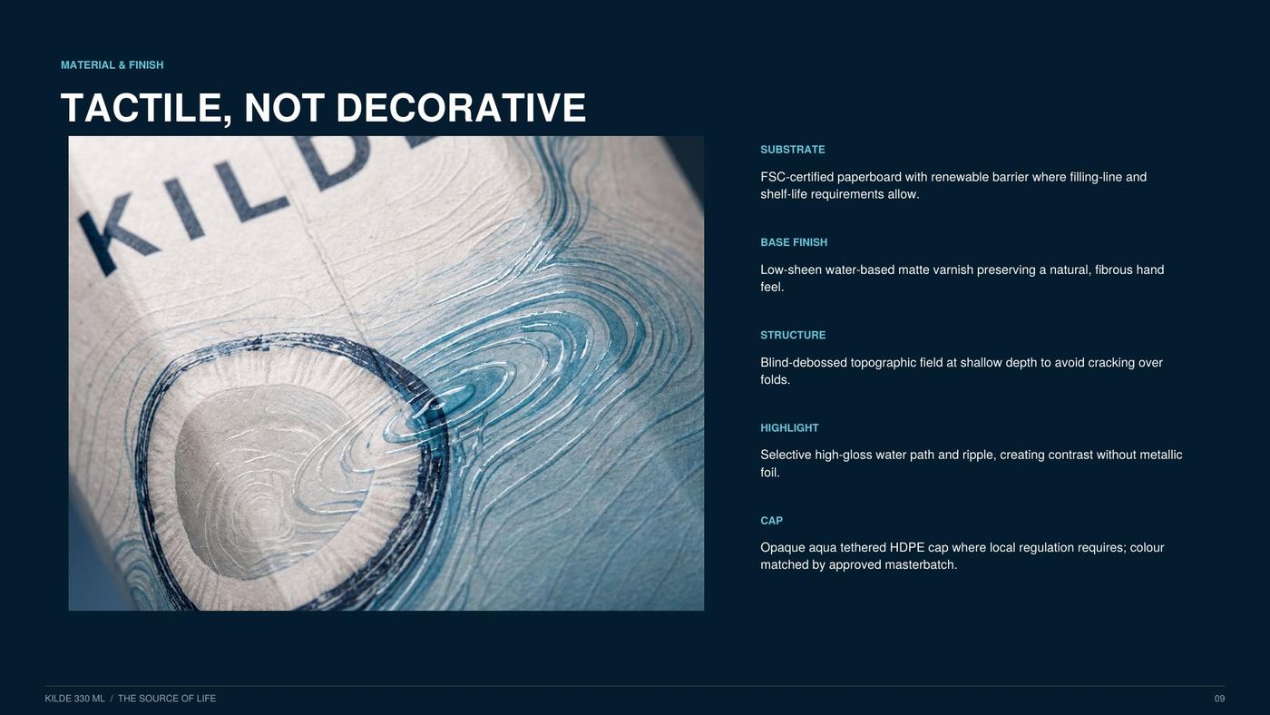
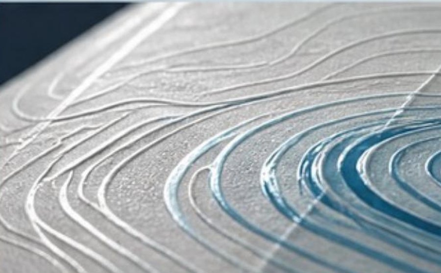
Adds tactile depth and evokes nature, body and origin.
Recognition rule: at least two of the four assets remain visible in every crop; the source line and ripple are mandatory on primary packaging. Launch line: «From nature. Through you.» · Brand phrase: «Naturens andre kilde.» · The visual language never makes a medical promise.
Visualization only. Final packaging requires a supplier dieline, laboratory-confirmed nutrition values and complete regulatory copy. Pantone references are directional pending physical drawdowns.
The KILDE mark is two gestures: the drop (isbre blue — the water itself) falling toward the spring arc (the surface it returns to). Below it, the wordmark in wide-tracked capitals, and the descriptor KOKOSVANN. Nothing else. The logo is quiet on purpose — the whiteness around it is part of the mark.
The approved Source of Life palette: Coconut Ivory carries the pack, Source Blue carries the brand, Living Aqua carries the water’s energy, Graphite carries function. No colour outside this system appears on packaging or campaign surfaces.
| Colour | HEX | RGB | CMYK | Pantone (rec.) | Role |
|---|---|---|---|---|---|
| Deep Fjord | #152435 | 21 · 36 · 53 | C60 M32 Y0 K79 | 5395 C | Authority — navy grounds, headers, text on light |
| Drop Blue | #4E7FA6 | 78 · 127 · 166 | C53 M23 Y0 K35 | 5405 C | Action — buttons, links, kickers, chart primary |
| Glacier Blue | #8AAEC6 | 138 · 174 · 198 | C30 M12 Y0 K22 | 5425 C | Recognition — the cap, the drop, accents on navy |
| Snow | #EDF2F6 | 237 · 242 · 246 | C4 M2 Y0 K4 | 656 C | Page background — cold paper white |
| White | #FFFFFF | 255 · 255 · 255 | C0 M0 Y0 K0 | — | Card surfaces and document grounds |
| Primary text | #22272D | 34 · 39 · 45 | C24 M13 Y0 K82 | Black 6 C | Body text on light |
| Secondary text | #65717D | 101 · 113 · 125 | C19 M10 Y0 K51 | 431 C | Captions, metadata, secondary labels |
Two layers, one brand: the Source of Life packaging palette above colours the carton; the institutional platform palette here colours the website, PDFs and Excel. Both layers appear identically in the Brand Guide PDF. Pantone values are recommendations pending a physical print drawdown.
The institutional platform (this website and the document suite) renders the same brand in WCAG-checked derivatives — deep navy surfaces and glacier tints defined centrally in the shared token file. Pantone references are directional pending physical drawdowns.
Archivo speaks in display; Nunito Sans carries text; Nunito labels and numerals — a rounded, friendly companion that keeps data warm and approachable. The wordmark tracking (+32%) belongs to the logo alone — headlines are set tight, facts are set in rounded Nunito.
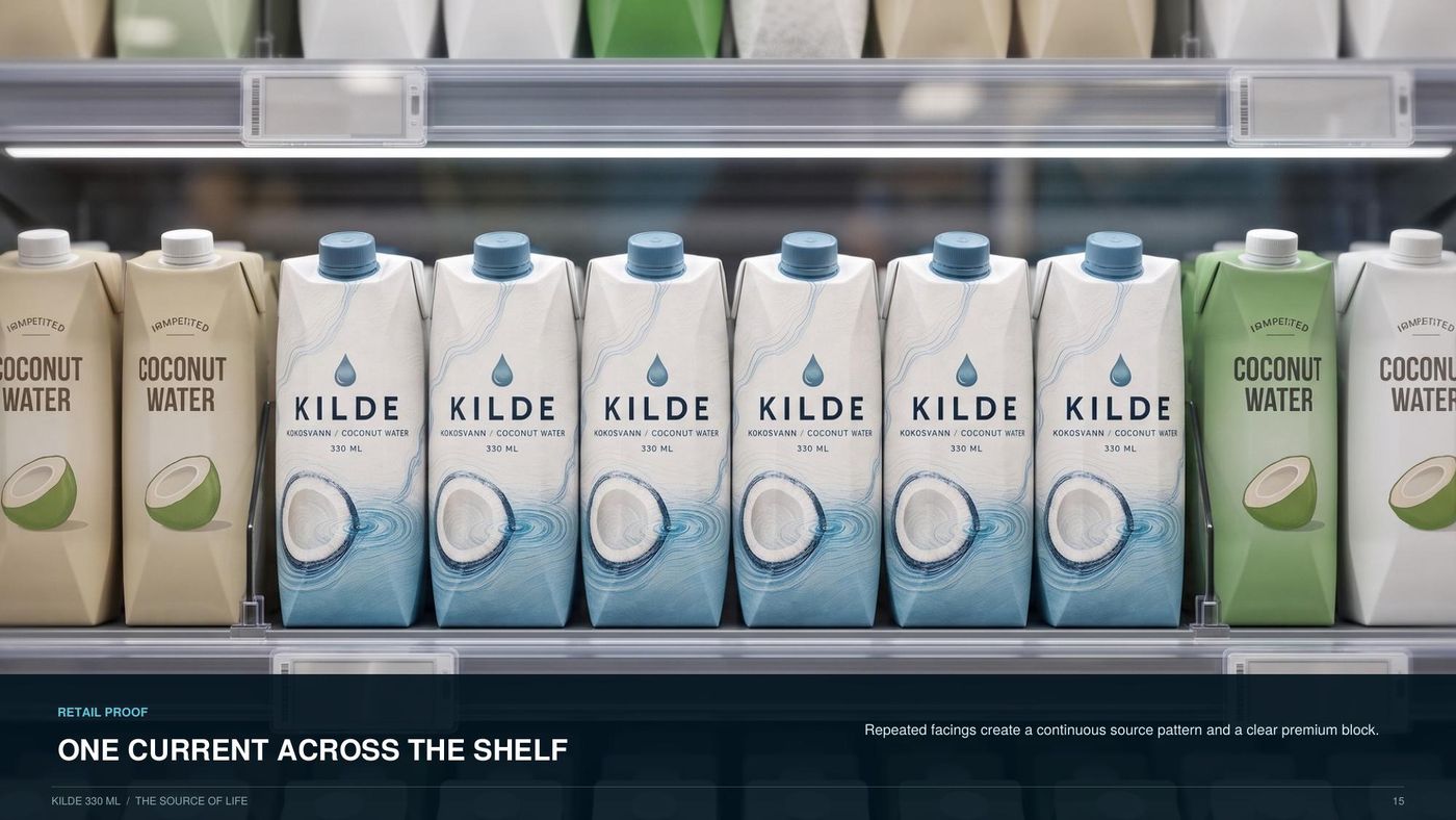
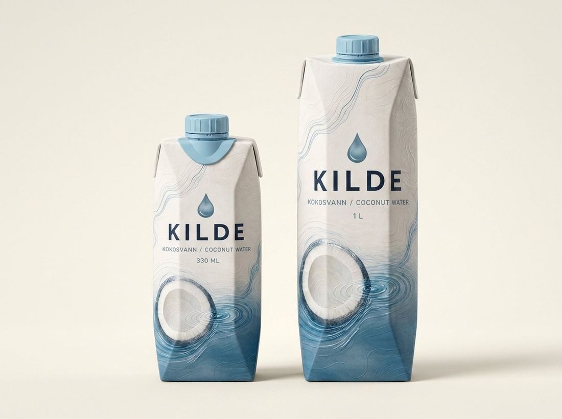
The launch family is 330 ml + 1 L, both with resealable screw caps — KILDE is water you open, reseal and carry through the day. One continuous system: source line from beneath the cap, coconut section at the base, spot-gloss ripple and debossed topography across every panel. At least two of the four assets remain visible in every crop; the source line and ripple always remain on primary packaging.


Cap status — controlled statement. The recommended launch direction uses a glacier-blue cap as a shelf-recognition asset. Final colour, material, MOQ, cost, food-contact compliance, recyclability and lead time remain subject to written supplier confirmation. The approved fallback is a white cap with controlled blue shoulder treatment.
Claim-status rule: only claims marked approved in the claims register (packaging system, section 07) may appear on final artwork; potassium and muscle-function claims are excluded until formally approved. Legal safe zones — nutrition panel, barcode and mandatory text — are locked; brand elements never enter them.
KILDE photography looks like a Norwegian spring, not a tropical holiday. Backgrounds are seamless Isbre-tint gradients (#DCE8F1 → #EDF2F6), light is cool and directional, water and ice are real and in motion. The coconut appears as raw material — cracked, honest, never decorated with palm leaves, straws or sand. Film follows the same rules: slow water, still cartons, cold Nordic light — see the Source of Life film above and the occasion films on the Product page.
Three sanctioned layout patterns cover 90% of marketing. Each pairs one colour combination from Section 02 with one voice line. Headlines in Norwegian; the drop may replace the dot of an «i» — nowhere else.
Calm, factual, quietly proud. KILDE never shouts, never uses exclamation marks, never says «tropisk paradis». It states facts the way a spring does — plainly. Master lines: «Fra naturens kilde.» — “From nature’s source” (tagline) · «Naturens andre kilde.» — “Nature’s second source” (carton story) · «Etter badstu. Etter trening.» — “After sauna. After training.” (occasion). No nutrition or health claims are used anywhere — on pack, in film or in copy — until laboratory analysis and Norwegian food-law review are complete. The visual language never makes a medical promise.
Asset custody: master logo files, carton dielines (330 ml / 1 L, pending supplier confirmation), fonts and photography live in the KILDE brand folder; artwork for printing plates must be approved against this guide before release to the co-packer. Questions route to brand ownership at Kilde Kokosvann.
Headers: Deep Fjord grounds, condensed uppercase display, glacier kickers. Buttons: navy primary and outlined ghost, uppercase labels, 44 px minimum touch targets. Cards & tables: white surfaces, 1 px hairlines, uppercase headers on navy or snow. Charts: Drop Blue primary, Glacier secondary, no 3D, no gradients. Forms: visible labels, honest success and error states. Mobile: single column below 760 px, zero horizontal overflow, sticky contact actions. Data-room cards: designed cover thumbnail, one-sentence purpose, full metadata line, preview and download. Accessibility: WCAG AA contrast, focus-visible outlines, reduced-motion respected, alt text on every image.
Excel: cover and dashboard first; logo, sheet number, title, purpose, active scenario, currency/units and version on every presentation sheet; gridlines and headings hidden; defined print areas; Calibri. Input conventions: blue font = editable input, black = formula, green = internal link, red = external link; yellow fill = pending assumption, pale blue = verified quotation, grey = calculated output, green/red = passed/failed checks. Financial Summary, Investor Snapshot, brochure, distributor sheet, presentations and supplier documents share this guide's page furniture — kicker, condensed title, rule, versioned footer — and quote the controlled cap statement verbatim. Version stamp: KILDE Institutional Platform v3.5 · July 2026 on every published file; controlled filenames KILDE_<Document>_v3.5_2026-07.
Tone of voice. KILDE sounds calm, honest, clear, Scandinavian, commercially intelligent, evidence-based — premium but not arrogant. Never: «miracle», «world's healthiest water», «perfect hydration», «guaranteed wellness», unsupported superiority claims, or aggressive investor language.
Sources of truth. This Brand Guide governs design. The integrated Excel model governs the numbers; the packaging specification governs product presentation; the source register governs evidence. Where documents disagree, those sources prevail and the conflicting document is corrected in a version-controlled release.